
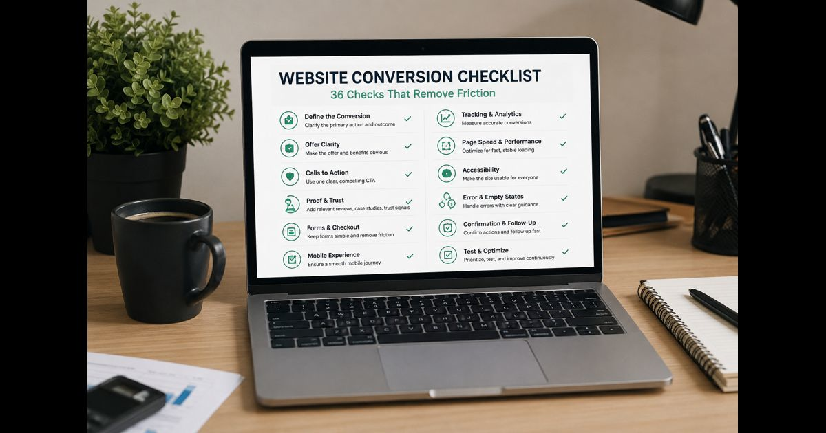
A website conversion checklist helps identify what prevents a visitor from completing a valuable action, such as requesting a quote, booking an appointment, starting a trial, making a purchase, calling a business, or submitting an application.
The review should follow the visitor’s journey from arrival to confirmation. Start by validating measurement, then examine the offer, page message, proof, calls to action, forms, mobile experience, technical reliability, and what happens after submission. Changing button colors or adding more persuasive copy will not solve a broken form, an unclear offer, or inaccurate tracking.
Website Conversion Checklist at a Glance
Before examining individual details, confirm these essentials:
- The website has one clearly defined primary conversion.
- Each important page has a specific role in the conversion journey.
- Analytics records completed actions accurately.
- The page matches the promise that brought the visitor there.
- The offer, intended customer, and outcome are immediately understandable.
- One primary action is visually and verbally clear.
- Important claims are supported by relevant evidence.
- Pricing, eligibility, limitations, or commitments are explained before the visitor acts.
- Forms and checkout steps request only necessary information.
- The complete journey works on a real mobile device.
- Errors explain what happened without deleting entered information.
- Successful actions produce a clear confirmation.
- Changes are prioritized by evidence and business impact.
- Results are assessed by conversion quality as well as conversion volume.
A failed item does not automatically require a redesign. Many conversion problems can be corrected through focused changes to one page, message, form, or process.
1. Define the Conversion Before Reviewing the Website
A conversion review becomes unreliable when “success” has not been defined.
Choose the most valuable action the website should produce. Depending on the business, this might be:
- A completed purchase
- A qualified enquiry
- A booked appointment
- A phone call from an appropriate prospect
- A trial or account activation
- A completed application
- A donation
- A reservation
Secondary actions can also be recorded, but they should not be confused with the primary outcome. Viewing a pricing page, playing a video, downloading a document, or beginning a form may indicate progress without creating business value on its own.
For each important page, write down:
- The visitor it serves
- The decision it helps that visitor make
- The primary action available
- The next page or step
- The evidence needed before action
- The concern most likely to stop progress
Do not combine every technical, content, and visibility issue into the same review. A broader small business website audit serves that purpose. A conversion review concentrates on obstacles between a relevant visit and a completed business outcome.
2. Establish a Reliable Measurement Baseline
The conversion rate is calculated as:
Conversion rate = completed conversions ÷ eligible visits × 100
The denominator must remain consistent. A business may use sessions, Shine Frik users, product views, checkout starts, or another eligible group, but comparisons become misleading when the basis changes between reports.
Record a baseline for:
- Total completed conversions
- Conversion rate
- Conversion rate by device
- Conversion rate by landing page
- Conversion rate by traffic source
- Form starts and successful submissions
- Checkout starts and completed purchases
- Qualified and unqualified leads
- Revenue, booking value, or another downstream outcome
- Cancellations, refunds, spam, or duplicate submissions
Raw conversion volume can hide serious problems. Ten qualified enquiries may be more valuable than fifty irrelevant form submissions. A purchase rate can rise while average order value or profit falls. Use supporting metrics to confirm that improvement in one number has not damaged a more important result.
Validate the tracking manually
Complete the primary action yourself and confirm that:
- The correct event is recorded.
- It fires once rather than several times.
- Refreshing a confirmation page does not create another conversion.
- Failed submissions are not counted as successful.
- Test, staff, bot, and spam activity is handled appropriately.
- Cross-domain booking or payment steps preserve the journey where required.
- Consent choices do not create unexplained reporting differences.
- Phone, chat, booking, and offline outcomes are reconciled where possible.
If tracking is unreliable, record that as the first issue to fix. Optimization decisions based on false data can make a page worse while reporting an apparent improvement.
3. Map the Complete Conversion Path
Review the actual sequence a visitor follows:
- Entry page
- Offer or service information
- Supporting proof
- Pricing, eligibility, or decision details
- Call to action
- Form, booking, account, cart, or checkout
- Payment or final submission
- Confirmation
- Follow-up from the business
A visitor can abandon the journey at any transition. Checking only the landing page misses problems such as an unexpected account requirement, unavailable appointment times, unclear delivery costs, a payment error, or a confirmation that never arrives.
For every step, ask:
- Does the visitor know why this step is necessary?
- Is any required information missing?
- Does the next step match what the previous button promised?
- Is progress preserved if the visitor goes back?
- Can the visitor recover from an error?
- Does the journey introduce an unexpected cost or commitment?
- Is responsibility clear after the conversion reaches the business?
The final question matters. A form can convert successfully while the business loses the opportunity through slow routing, a full inbox, missed calls, or an unclear internal owner.
4. Make the Offer Understandable
A visitor should be able to determine:
- What is being offered
- Who it is intended for
- Which problem it addresses
- What outcome it provides
- Why this option may be appropriate
- What the next step requires
Review the headline, supporting copy, images, service descriptions, product details, pricing information, and calls to action together. They should communicate one coherent proposition.
The homepage’s opening section should explain the business clearly, but the same standard applies to service, product, campaign, and landing pages. A visitor arriving directly on an internal page should not need to return to the homepage to understand the offer.
Replace vague statements with useful specifics. “Better solutions for modern businesses” communicates little. A clearer version identifies the service, intended customer, relevant outcome, or operating area.
Check that the page answers practical decision questions:
- What is included?
- What is not included?
- Who is eligible?
- How long does the process take?
- What information is required?
- Is there a price, starting price, fee structure, or quotation process?
- Are there location, availability, delivery, or compatibility limits?
- What happens after the visitor responds?
Do not hide a material condition until the form, checkout, or sales conversation. Surprises near the end of the journey create abandonment and low-quality conversions.
5. Match the Page to the Visitor’s Starting Point
The page must continue the promise made by the source that sent the visitor.
Check landing pages reached through:
- Organic results
- Paid advertisements
- Social posts
- Directory listings
- Referral partners
- QR codes
- Internal website links
The wording, offer, audience, location, product, and expected action should remain consistent. An advertisement for a particular service should not lead to a general homepage that forces the visitor to find it again. A page describing a free assessment should not reveal an unexpected payment requirement after the visitor begins.
Different traffic sources may also represent different levels of readiness. A returning visitor opening a pricing page may need fewer introductory explanations than a first-time visitor reading an educational article. The page should provide a direct path without removing information needed by less familiar visitors.
6. Give Each Page One Dominant Next Step
A useful page can contain several links without giving every action equal visual weight.
Identify:
- The primary action
- A lower-commitment alternative, if genuinely useful
- Supporting navigation
- Nonessential distractions
The primary call to action should:
- Describe the next step accurately.
- Use consistent wording throughout the page.
- Be easy to recognize as an interactive control.
- Appear when a visitor may reasonably be ready.
- Remain usable on mobile and with a keyboard.
- Lead to the correct destination.
- Avoid implying an instant result if additional steps are required.
“Submit” gives little information. “Request a Quote,” “Check Availability,” “Book an Appointment,” or “Complete Purchase” sets a clearer expectation.
Do not assume that adding more buttons will increase conversions. Repeating the same action can help on a long page when it follows meaningful decision points. Placing several competing buttons in every section can make the page feel aggressive and obscure the main route.
7. Place Evidence Where Doubt Occurs
Proof is most effective when it supports a specific claim or reduces a specific concern.
Useful evidence may include:
- Detailed customer reviews
- Relevant case results
- Work samples
- Demonstrations
- Product specifications
- Professional credentials
- Independent certifications
- Real team and business information
- Transparent policies
- Accurate operating history
- Clear guarantees with complete conditions
Review each major claim and ask what would allow a cautious visitor to verify it. “Trusted by thousands” is weak if no context or evidence is available. A short case example showing the customer’s situation, work completed, and measured result is more informative.
Place evidence near the decision it supports. Delivery reviews belong near delivery concerns. Security information belongs near payment or account creation. Service outcomes belong near the relevant service, not only on a separate testimonial page.
Remove unsupported awards, fabricated counters, stock testimonials, expired certifications, false scarcity, and security symbols that do not reflect the actual system. Decorative trust elements can reduce credibility when they appear unverifiable.
8. Remove Form Friction Without Removing Necessary Qualification
Every field should have a reason to exist.
For each field, determine whether the information is needed:
- To complete the transaction
- To assess eligibility
- To route the request
- To prepare an appropriate response
- To meet a genuine operational or legal requirement
Information that can be collected later should not automatically be required at the first step. However, the shortest possible form is not always the best form. A service business may need several qualifying details to avoid wasting the visitor’s time and creating unusable leads.
Check that forms provide:
- Persistent visible labels
- Appropriate input types
- Autocomplete where suitable
- Clear required and optional distinctions
- Instructions before a difficult field
- Specific error messages
- Preservation of valid entries after an error
- A visible submission state
- Protection against accidental repeated submission
- A working privacy notice
- A clear confirmation
- An expected response time
Test valid and invalid entries. Try an incomplete form, a mistyped email, an international phone number, a long name, a slow connection, and a repeated click. Confirm that errors identify the exact problem rather than displaying a generic failure message.
9. Review Checkout, Booking, and Account Creation Separately
Complex transactions require additional checks.
For ecommerce checkout
Confirm that:
- The cart retains selected items.
- Product, quantity, price, discounts, shipping, tax, and total are clear.
- Delivery estimates appear before final payment.
- Return and cancellation terms are accessible.
- Guest checkout is available where appropriate.
- Account creation does not introduce unnecessary steps.
- Payment errors are understandable and recoverable.
- Out-of-stock or unavailable items are identified early.
- The order confirmation contains accurate details.
For booking journeys
Confirm that:
- Time zones, locations, service duration, and availability are clear.
- Unavailable appointments cannot be selected.
- Required preparation is explained before confirmation.
- Rescheduling and cancellation terms are visible.
- Calendar and email confirmations contain the correct details.
For accounts and trials
Confirm that:
- Password requirements appear before submission.
- Verification messages arrive reliably.
- Expired verification links can be replaced.
- Trial length, payment requirements, renewal, and cancellation are clear.
- The first screen after signup helps the user complete a meaningful action.
10. Test the Entire Journey on Mobile
A responsive layout is not enough. Complete the conversion on a real phone.
Check:
- Text readability without zooming
- Button and link spacing
- Sticky bars that do not cover content
- Menus that open, close, and retain focus correctly
- Forms that use suitable mobile keyboards
- Content that remains visible when the keyboard opens
- Pop-ups that can be dismissed
- Images and tables that do not create horizontal scrolling
- Payment and booking interfaces
- Tap-to-call, email, map, and messaging actions
- Orientation changes
- Slow or unstable connections
Compare performance by device, but do not treat a lower mobile rate as automatically acceptable. Investigate whether the difference reflects visitor behavior, page context, technical friction, or an incomplete mobile experience.
11. Include Accessibility in Conversion Review
Accessibility failures can prevent visitors from understanding information or completing an action.
Review whether:
- The page can be navigated by keyboard.
- Focus remains visible.
- Headings follow a meaningful order.
- Form fields have programmatically associated labels.
- Error messages are announced and understandable.
- Text and controls have sufficient contrast.
- Meaning is not communicated by color alone.
- Images containing useful information have appropriate alternative text.
- Buttons and links have descriptive names.
- Enlarged text does not overlap or disappear.
- Video or audio needed for a decision has an accessible alternative.
Automated checks can identify some problems, but they cannot confirm that a complete journey is understandable. Manual keyboard testing and human review remain necessary.
12. Check Performance and Visual Stability
Review the pages that receive valuable traffic and the steps closest to conversion.
Look for:
- Slow display of the main content
- Delayed response after a tap or click
- Buttons that move while the page loads
- Large uncompressed images
- Video backgrounds that delay the offer
- Excessive scripts or tracking tags
- Third-party widgets that block interaction
- Fonts that cause content to shift
- Slow payment, map, chat, or booking integrations
- Layout changes caused by banners or consent notices
A laboratory score alone does not describe every visitor’s experience. Combine technical testing with real-user performance data where available and complete the journey under realistic mobile conditions.
13. Find Broken and Unclear States
Conversion paths must work when conditions are imperfect.
Test:
- Broken links
- Missing pages
- Out-of-stock products
- Unavailable appointments
- Declined payments
- Expired sessions
- Duplicate submissions
- Network interruption
- Server errors
- Incorrect discount codes
- Empty results
- Full inboxes or failed notification delivery
Every failure state should explain what happened, preserve as much progress as possible, and offer a safe next step. A generic error page with no recovery route can lose a visitor who was otherwise ready to convert.
14. Confirm What Happens After Conversion
A successful action needs a clear conclusion.
The confirmation should state:
- That the action was completed
- What was received or purchased
- What happens next
- When the visitor should expect a response or delivery
- How to correct a mistake
- How to obtain support
- Any required preparation
Then test the internal process:
- Does the request reach the right person or system?
- Is the customer information complete and readable?
- Are duplicate alerts controlled?
- Is an owner assigned?
- Is there an expected response time?
- Can the outcome be connected to the originating page or channel?
- Are qualified, unqualified, completed, cancelled, and refunded outcomes recorded?
Conversion optimization does not end at the thank-you page. Poor follow-up can erase the value created by an effective website.
15. Prioritize Problems Before Making Changes
Record each issue with:
- Page or journey step
- Evidence
- Visitor affected
- Business consequence
- Severity
- Frequency or reach
- Confidence in the diagnosis
- Estimated effort
- Responsible owner
- Baseline metric
- Expected outcome
Use this order:
- Fix broken submissions, checkout failures, incorrect information, and other blockers.
- Correct inaccurate tracking.
- Address problems affecting high-value or high-traffic journeys.
- Clarify the offer, conditions, and next step.
- Reduce form, checkout, mobile, and accessibility friction.
- Strengthen relevant evidence.
- Test lower-confidence design and copy ideas.
Do not prioritize an easy cosmetic change above a serious functional problem simply because it can be completed quickly.
16. Test Changes Without Creating Misleading Results
Write a hypothesis that connects evidence, a change, and an expected outcome:
Because visitors are encountering [observed problem], changing [specific element] should improve [primary measure] without harming [guardrail measure].
Guardrails may include lead quality, revenue per order, refund rate, cancellation rate, support requests, or page performance.
When traffic is sufficient for a controlled experiment:
- Change one meaningful variable or one coherent experience.
- Confirm tracking before launch.
- Define the main outcome in advance.
- Include a relevant audience.
- Avoid stopping when an early result looks favorable.
- Consider seasonality, campaigns, outages, and traffic-source changes.
- Record neutral and negative results as well as wins.
A low-traffic website should not wait indefinitely for an A/B test that cannot produce a dependable result. It can use:
- Moderated usability sessions
- Session recordings
- Form error reports
- Customer and sales-team feedback
- Support enquiries
- Funnel drop-off data
- Careful before-and-after comparisons
- Direct testing of broken or confusing tasks
Before-and-after results require caution because traffic quality, promotions, demand, and seasonality may change at the same time.
Website Conversion Review Worksheet
| Check | Evidence | Priority | Owner | Baseline | Action | Result |
| Primary conversion | Defined and measurable | |||||
| Tracking accuracy | Test completion recorded once | |||||
| Offer clarity | Audience and outcome understood | |||||
| CTA | One accurate dominant action | |||||
| Proof | Claims supported near decisions | |||||
| Form or checkout | Complete and recoverable | |||||
| Mobile | Full journey works on a phone | |||||
| Accessibility | Essential actions remain usable | |||||
| Performance | Page responds without disruptive delay | |||||
| Confirmation | Outcome and next step are clear | |||||
| Follow-up | Request reaches an accountable owner |
Final Thoughts
An effective website conversion checklist does more than review headlines and buttons. It verifies that the business is measuring the correct outcome, the visitor understands the offer, every step works, important concerns are answered, and completed actions receive dependable follow-up.
Begin with blockers and measurement errors. Then improve clarity, proof, forms, mobile usability, accessibility, performance, and recovery from failure. Measure both the number and quality of conversions so that a higher reported rate also represents a better business result.
Frequently Asked Questions
What is a website conversion?
A website conversion is the completion of a defined valuable action, such as a purchase, qualified enquiry, booking, trial activation, application, donation, or phone call. The appropriate action depends on the website’s business purpose.
What is a good website conversion rate?
There is no universal rate that applies to every website. Results vary by offer, industry, traffic source, device, price, commitment, and how a conversion is defined. Compare equivalent periods and segments against the website’s own verified baseline, while also monitoring lead quality, revenue, cancellations, and refunds.
What should be fixed first on a low-converting website?
Fix anything that prevents completion: broken forms, payment errors, unavailable booking steps, incorrect information, serious mobile problems, or misleading buttons. Validate tracking next, because inaccurate data makes later decisions unreliable.
Should every page have a call to action?
Every important page should provide a logical next step, but that step does not always need to be a sale or enquiry. An early-stage educational page may direct the visitor to relevant decision information, while a service or product page may support a direct commercial action.
How often should a conversion checklist be completed?
Review critical journeys after major page, offer, pricing, form, checkout, analytics, or platform changes. A broader scheduled review every quarter is useful for active websites, with immediate testing after an unexplained fall in qualified leads or sales.
Can conversion optimization hurt performance?
Yes. Aggressive pop-ups, excessive urgency, hidden conditions, reduced qualification, or misleading calls to action may increase short-term submissions while lowering trust or lead quality. Every change should be assessed against both the primary conversion and relevant guardrail measures.


Pingback: Inside Zavalio Com: Strategy for Smarter Digital Growth